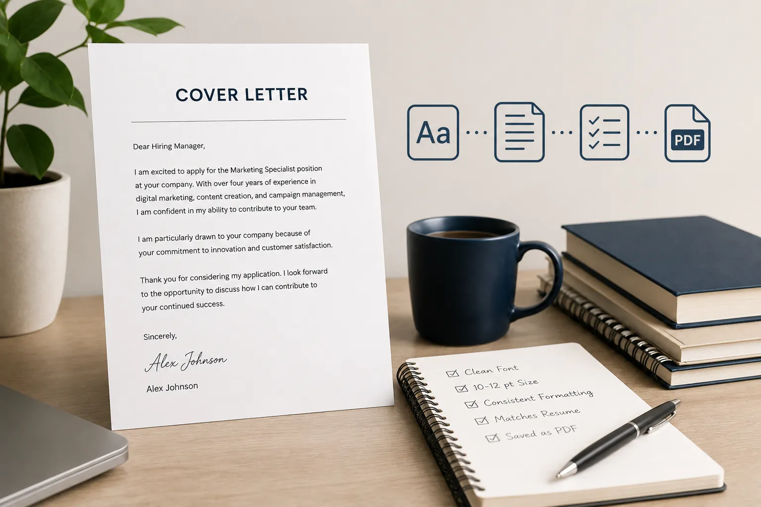

Most job seekers spend hours agonizing over their cover letter’s wording and almost none on the font it’s written in. That’s a mistake. Before a hiring manager reads your first sentence, they’ve already registered the look of your letter, and that split-second impression shapes how generously they read everything that follows.
The right cover letter font doesn’t announce itself. It simply gets out of the way, letting your experience and enthusiasm come through clearly on screen, in print, and inside the applicant tracking systems (ATS) that scan most applications before a human ever sees them.
The wrong font does the opposite: it distracts, strains the eyes, or , in the worst cases, gets mangled by scanning software before your qualifications even register.
This guide walks through everything you need to know about cover letter fonts: which ones work best, which to avoid, how to size and space them correctly, and how to make a choice that fits your industry and your personal brand. Whether you’re applying to a law firm, a design studio, or a fast-growing tech startup, you’ll find a clear, practical answer here.
Key Takeaways
- Stick with clean, modern fonts such as Calibri, Garamond, Cambria, Georgia, or Aptos , they read well on screen and in print, and they’re ATS-friendly.
- Use a font size between 10 and 12 points for body text; never drop below 10 points, even if your letter runs long.
- Match your cover letter font to your resume font so your application reads as one cohesive, polished package.
- Avoid decorative, script, extra-bold, or ultra-thin fonts , they hurt readability and can confuse ATS parsing.
- Always export your finished cover letter as a PDF so your font choice stays exactly as you designed it, regardless of the device or software the recruiter uses to open it.
A Tale of Two Cover Letters: Good Font vs. Bad Font
It helps to see the contrast in practice. Picture two cover letters with identical content , same job title, same achievements, same closing line , but different fonts.
Letter A is set in Calibri, 11-point, with 1.15 line spacing and one-inch margins. The header stands slightly larger than the body text. It looks calm and easy to scan, whether it’s opened on a laptop screen or printed for an in-person interview.

Letter B uses a bold, playful script-style font at 14 points to “stand out.” The letters slant and loop into one another, the margins are cramped to fit everything on one page, and the ATS that scans it strips out several words because the character shapes don’t match its recognition library.

The content in both letters might be identical, but the reader’s experience , and the software’s ability to process the file , is not. Font choice doesn’t just affect aesthetics; it affects whether your letter is read the way you intended at all.
| Aspect | Letter A: Calibri, 11 pt | Letter B: Decorative Script, 14 pt |
|---|---|---|
| First Impression | Clean, professional, and intentional. | Distracting, overly casual, and unprofessional. |
| ATS Compatibility | Parses accurately, preserving keywords and formatting. | High risk of text being misread or ignored by ATS software. |
| On-Screen Readability | Easy to read and scan at any zoom level. | Difficult to read, making it harder for recruiters to skim. |
| Print Clarity | Sharp, crisp, and highly legible when printed. | Letters may blur, overlap, or lose clarity in print. |
| Perceived Professionalism | Demonstrates attention to detail and good formatting choices. | Suggests poor formatting judgment and reduces credibility. |
The lesson isn’t that you need an exciting font to be memorable , it’s that clarity and restraint are what actually make a cover letter stand out for the right reasons.
Why Your Cover Letter Font Actually Matters
It’s tempting to treat font choice as a cosmetic afterthought. In practice, it does three jobs at once: it shapes the reader’s first impression, it determines whether your letter survives automated screening, and it quietly signals something about your professional judgment.
It sets the tone before a single word is read
Hiring managers and recruiters often review dozens of applications in a single sitting, and most form an initial impression of a document within seconds of opening it.
A clean, well-proportioned font reads as intentional and professional. A cramped, oversized, or overly stylized one reads as careless , even if the writing behind it is excellent.
It determines whether ATS software can read you at all
Most mid-size and large employers run applications through an applicant tracking system before a recruiter ever opens them. These tools scan for keywords, parse contact details, and rank candidates , and they work far more reliably with plain, standard fonts than with decorative or unusual ones.
Choose an unfamiliar or overly stylized typeface, and there’s a real chance some of your text gets misread or dropped entirely, taking your qualifications with it.
It quietly communicates your personal brand
Typography carries psychological weight. Serif fonts , the ones with small decorative strokes at the ends of letters, like Garamond or Georgia , tend to read as traditional, authoritative, and established, which is part of why they remain popular in law, finance, and academia.
Sans-serif fonts, which drop those strokes for cleaner lines, tend to read as modern, direct, and efficient, making them a natural fit for tech, marketing, and startup culture. Neither style is objectively better; the goal is choosing the one that matches the impression you want to leave.
“You never get a second chance to make a first impression.” – Will Rogers
QUICK FACT: WHAT IS AN ATS?
An applicant tracking system (ATS) is software that employers use to collect, sort, and rank job applications automatically. It scans your cover letter and resume for keywords, formatting, and contact information before a recruiter ever opens the file , which is exactly why simple, standard fonts consistently outperform decorative ones in getting your application seen.
The Best Cover Letter Fonts to Use
These fonts show up again and again in hiring guidance for good reason: they’re legible on screen, they print cleanly, and they parse reliably through ATS software. A mix of serif and sans-serif options is included so you can pick based on the tone you want your letter to carry.
Calibri: The default font in Microsoft Word for well over a decade, Calibri has a soft, rounded sans-serif shape that reads as approachable but still professional. It’s a safe, versatile choice across nearly every industry.
Garamond: A classic serif typeface with roots in 16th-century French printing, Garamond has an elegant, slightly narrow letterform that stays legible even at smaller sizes. It suits law, publishing, academia, and executive-level applications especially well.
Cambria: Designed specifically for comfortable on-screen reading, Cambria is a sturdy serif font that holds up well in both digital and printed formats. It’s a strong pick for management, engineering, and technical roles.
Georgia: Often described as a more contemporary alternative to Times New Roman, Georgia is a serif font built for screens, with generous spacing that keeps text from feeling cramped. It works well across most white-collar industries.

Arial: A clean, no-nonsense sans-serif font that’s universally available and instantly familiar. Arial won’t win points for originality, but it’s dependable, ATS-safe, and appropriate almost anywhere.
Helvetica: A design classic known for its neutral, balanced letterforms, Helvetica carries a quietly confident, modern feel. It’s a popular choice in creative, media, and design-adjacent fields.
Constantia: A softer serif font with rounded details, Constantia feels warm without losing formality. It’s a good option for roles in healthcare, education, and client-facing positions.
Avenir: A geometric sans-serif with clean, evenly weighted strokes, Avenir has a modern, minimalist feel that works particularly well for marketing, design, and creative-industry applications.
| Font | Type | Personality | Best For |
|---|---|---|---|
| Calibri | Sans-serif | Warm, modern, versatile | Any industry; strong default choice |
| Garamond | Serif | Classic, refined | Law, academia, publishing, executive roles |
| Cambria | Serif | Sturdy, dependable | Management, engineering, technical fields |
| Georgia | Serif | Contemporary, readable | Finance, consulting, general corporate roles |
| Arial | Sans-serif | Neutral, familiar | Any industry; ATS-safe fallback |
| Helvetica | Sans-serif | Clean, confident | Design, media, creative agencies |
| Constantia | Serif | Warm, formal | Healthcare, education, client-facing roles |
| Avenir | Sans-serif | Geometric, minimalist | Marketing, branding, creative industries |
Serif vs. Sans-Serif: Which Should You Choose?
Nearly every font recommendation on this page falls into one of two categories, so it’s worth understanding the distinction before you commit to one. Serifs are the small decorative strokes at the ends of letters , think of the little “feet” on the letters in a printed book. Sans-serif fonts drop those strokes entirely, resulting in cleaner, more uniform lines.
There’s a common myth that serif fonts are inherently easier to read than sans-serif ones. In reality, legibility research has found little meaningful difference between the two styles at normal reading sizes , the gap only widens slightly at very small text or on low-resolution screens. What actually differs is tone, not readability.
| Aspect | Serif Fonts | Sans-Serif Fonts |
|---|---|---|
| Feel | Traditional, formal, authoritative | Modern, clean, direct |
| Examples | Garamond, Cambria, Georgia, Constantia | Calibri, Arial, Helvetica, Avenir |
| Best-Fit Industries | Law, finance, academia, publishing | Technology, marketing, design, startups |
| Screen Readability | Strong when designed for digital use | Consistently strong across devices |
When you’re genuinely unsure which category fits, default to sans-serif. It reads as slightly more contemporary across nearly every industry today, and it’s rarely seen as the wrong choice, even in more traditional fields.
Cover Letter Fonts to Avoid
Some fonts are popular for a reason; others are popular for reasons that don’t belong anywhere near a job application. Steer clear of these.

| Font | Why to Avoid It |
|---|---|
| Comic Sans | Casual, childlike shapes that undercut professionalism in almost any industry. |
| Papyrus | Overly decorative texture that reads as dated and distracts from the content. |
| Brush Script / Any Cursive Font | Difficult to read at body-text size and prone to ATS parsing errors. |
| Courier / Courier New | Monospaced typewriter look that feels outdated and wastes horizontal space. |
| Impact | Extremely bold, condensed letterforms that overwhelm the page and feel aggressive. |
| Any “Thin” or “Light” Font Weight | Can appear faint or wash out on lower-quality screens and printers. |
Situational Fonts: When the Standard Rules Bend a Little
Not every font decision is black and white. A handful of fonts fall into a gray area , perfectly fine in the right context, but worth a second thought before you use them.
• Times New Roman: still entirely acceptable, especially in conservative fields, but it’s so common that it can be read as a default choice rather than a deliberate one. If you use it, pair it with generous spacing so it doesn’t feel dated.
• Roboto, Open Sans, and Ubuntu: clean, screen-friendly fonts that are popular in tech and software circles. They signal familiarity with digital products, which works well for engineering and IT applications but can feel slightly informal in more traditional industries.
• Montserrat and other geometric sans-serifs: strong for creative, design, and branding roles when used in a header or name line, but best kept out of dense body paragraphs, where their wide letterforms can slow down reading.
• A second display font for your header only: in creative fields, it’s acceptable to use a slightly more distinctive font for your name and contact details at the top of the letter, as long as the body text reverts to something simple and easy to scan.
PRO TIP
Before finalizing any font, type out two full paragraphs at your intended size and read them on both a laptop screen and a printed page. Fonts that look fine in a dropdown preview sometimes feel cramped or oversized once they’re carrying real sentences.
Three Examples of Fonts Chosen Correctly for the Situation
Seeing font choice applied to real scenarios makes the guidance easier to act on. Here’s how the same principles play out across three very different job applications.

Example 1: Applying to a Corporate Finance Firm
A candidate applying for a financial analyst role at an established investment firm chooses Garamond at 11.5 points, with standard one-inch margins and 1.15 line spacing. The serif font signals stability and attention to formal convention , values that align closely with the firm’s culture , while remaining crisp enough to read comfortably on screen.
Example 2: Applying to a Tech Startup
A software engineer applying to an early-stage startup uses Calibri at 11 points for the body of the letter, keeping formatting minimal and modern. The font choice mirrors the clean, uncluttered feel of the company’s own product and website, and it parses without issue through the startup’s ATS.
Example 3: Applying to a Design Studio
A graphic designer applying to a creative agency sets their name and contact information in Montserrat Bold at 16 points, then switches to a simple sans-serif like Avenir at 10.5 points for the body text. The header shows design sensibility; the body proves the candidate also understands when to let content lead.
How to Choose the Right Font for Your Cover Letter
If you’re still not sure which font fits your situation, work through these questions in order.
1. Consider your industry first. Conservative fields (law, finance, government, academia) lean toward serif fonts. Modern and creative fields (tech, design, marketing) lean toward sans-serif.
2. Match your resume. Using the same font across both documents creates a cohesive application and shows attention to detail , recruiters often review the two side by side.
3. Confirm ATS compatibility. Stick to widely supported fonts that come standard with Microsoft Word or Google Docs, since obscure or custom fonts may not render correctly once uploaded to an ATS.
4. Factor in seniority. Entry-level applications generally call for the safest, most conventional choices. Senior and executive applications have slightly more room for a font with a touch more personality.
5. Research the company’s visual identity. A quick look at a company’s website or brand materials can hint at whether a more modern or more traditional font will feel like a natural fit.
6. Test it at real size, on real paragraphs. Preview text and dropdown menus don’t reveal how a font behaves across four full paragraphs. Draft your actual letter before locking in your choice.
EXPERT RECOMMENDATION
When genuinely torn between two fonts, choose the more conservative option. A slightly safer font paired with a strong, specific cover letter will always outperform a bolder font paired with generic content. The font supports your message , it shouldn’t compete with it.
How to Determine the Correct Font Size and Spacing
Font choice is only half the equation. Size and spacing determine whether that font actually does its job on the page.
| Element | Recommended Setting |
|---|---|
| Body Text Size | 10–12 points (11 is the safest default for most fonts) |
| Header / Name Size | 14–16 points, bold; larger only if using a distinct header font |
| Line Spacing | 1.0–1.15 for standard fonts; up to 1.5 for larger serif fonts like Garamond |
| Margins | 1 inch on all sides (can narrow to 0.75 inch if the letter slightly overruns one page) |
| Paragraph Spacing | One blank line, or 6–10 points of space, between paragraphs |
| Minimum Font Size | Never below 10 points, even to force a one-page fit |
If your letter is spilling onto a second page, resist the urge to shrink the font past 10 points. Instead, tighten your writing, trim a paragraph, or adjust the margins slightly. A slightly longer letter set in a comfortable size will always read better than a cramped one-pager.
Tips for Using Fonts Effectively
- Use only one font throughout the letter , two at most if you’re giving your header a distinct style.
- Keep formatting consistent with your resume, including font, size hierarchy, and spacing.
- Use bold sparingly , for your name and section headers only, never for full sentences.
- Skip italics and underlining in the body text; they slow down reading and can trip up ATS parsing.
- Print a physical copy before your interview to confirm the font still looks sharp on paper.
- Save and send your final letter as a PDF so the font renders exactly as intended on any device.
Common Cover Letter Font Mistakes to Avoid
Most font-related mistakes come down to trying too hard or not double-checking the details. Watch for these.
- Choosing a font to be memorable. A distinctive font rarely gets remembered the way a strong opening line does , and it risks the opposite impression.
- Mixing more than two fonts. Multiple typefaces in one document create visual clutter and make the letter feel disorganized.
- Shrinking the font to force a one-page fit. Readability should never be sacrificed for length. Edit the content instead.
- Ignoring your resume’s font. A mismatched font between your resume and cover letter creates an inconsistent, less polished impression.
- Sending a .docx instead of a PDF. Word files can display in a substitute font if the recipient’s device doesn’t have yours installed, undoing all your formatting work.
- Skipping the print test. Some fonts that look sharp on screen lose clarity once printed, especially at smaller sizes.

Do’s and Don’ts of Cover Letter Fonts
Following a few simple best practices can make a significant difference in the quality and effectiveness of your work. While the right approach helps you achieve better results and avoid common pitfalls, small mistakes can reduce your credibility or create unnecessary challenges. The following do’s and don’ts provide clear, practical guidance to help you make informed decisions and get the best possible outcome.
Do’s
- Use one clean, professional font throughout your letter.
- Keep body text between 10 and 12 points.
- Match your cover letter font to your resume font.
- Choose a font suited to your industry and role.
- Test your font at real size before finalizing your letter.
- Save and send your letter as a PDF.
- Use bold only for your name and section headers.
Don’ts
- Mix more than two fonts in a single document.
- Shrink text below 10 points to force a one-page fit.
- Use a different font for each document in your application.
- Pick a font simply because it looks unique or exciting.
- Rely on how a font looks in a small dropdown preview.
- Send a .docx and assume the font will display correctly.
- Bold, italicize, or underline entire paragraphs of body text.
Create a Resume That Gets Results
Your cover letter font will never replace strong writing, but it can quietly undermine it if chosen carelessly , or reinforce it if chosen well. The safest strategy is also the most effective one: pick a clean, modern font like Calibri, Garamond, Cambria, or Georgia, size it between 10 and 12 points, keep your formatting consistent with your resume, and save the finished letter as a PDF.
“Simplicity is the ultimate sophistication.” – Leonardo da Vinci
That idea applies directly here. A restrained, well-chosen font won’t make your cover letter flashy, but it will make it easy to read, easy to trust, and easy to remember for the right reasons , which is exactly what gets a candidate to the next round.
FAQs
Yes. Using the same font on both documents creates a consistent, polished impression and shows attention to detail, since recruiters frequently review the two side by side.
Yes, Times New Roman is still an acceptable, ATS-safe choice, particularly in conservative industries like law and academia. It’s just so widely used that it can be read as a default rather than a deliberate decision.
It can. Standard fonts like Calibri, Arial, Georgia, Cambria, and Garamond parse reliably through applicant tracking systems. Decorative, script, or highly stylized fonts increase the risk of misread text or dropped keywords.
Both are safe, ATS-friendly choices. Calibri tends to feel slightly warmer and more contemporary, while Arial reads as more neutral and utilitarian. Either is appropriate; the choice often comes down to personal preference.
It’s optional. Many professional cover letters use one font throughout for simplicity. In creative fields, a slightly bolder or more distinctive font for the name and header line, paired with a simple font in the body , can add polish without sacrificing readability.
Generally, no. Even in creative industries, decorative and script fonts are hard to read at body-text size and often fail ATS parsing. Creative candidates are better off letting their portfolio or work samples carry the creativity, while the cover letter stays clean and easy to read.
Save and send your cover letter as a PDF whenever the application allows it. PDFs embed your font choice directly into the file, so it displays exactly as designed no matter what device, operating system, or software the recruiter uses to open it. Word documents (.doc or .docx) can substitute a different font if your chosen one isn’t installed on the recipient’s computer.
No. Bold formatting should be reserved for your name, your header, or the occasional section label , never for full paragraphs. Bolding entire blocks of body text makes a letter harder to read and can come across as though every sentence is being shouted.