
Your resume is one of the most important tools for your job search. It shows a potential employer who you are, your skills and training, work experience, achievements, and education. For a very long time, it was believed that resumes should steer clear of creative design and colors and instead follow a simplistic black-and-white format.
Undoubtedly, the classics never go out of style, but today, resume experts believe you can add colors to your resume. A colored resume is especially great for positions like graphic designers, illustrators, interior designers, fashion designers, and visual artists. However, be careful while doing so.
Not all colors are suitable for your resumes, and the way you use colors is an important matter.
Read on to discover how you can use colors to make your resumes stand out and what colors are the best for your resumes.
What Are the Best Colors for a Resume?
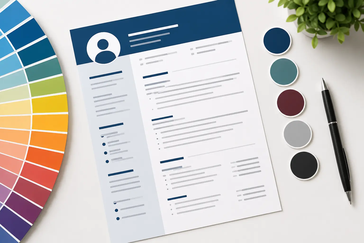
The safest resume uses black or dark-gray body text on a white background, with one restrained accent color such as navy, dark blue, dark green, or burgundy for headings.
A resume does not need color to look modern or professional. A well-designed black-and-white resume remains an excellent choice for almost any occupation. Color is optional and works best when it improves visual hierarchy without competing with your experience, skills, and achievements.
If you use color, keep the body text dark and reserve your accent color for elements such as your name, section headings, divider lines, or small design details. Avoid using color simply to make the resume look more creative.
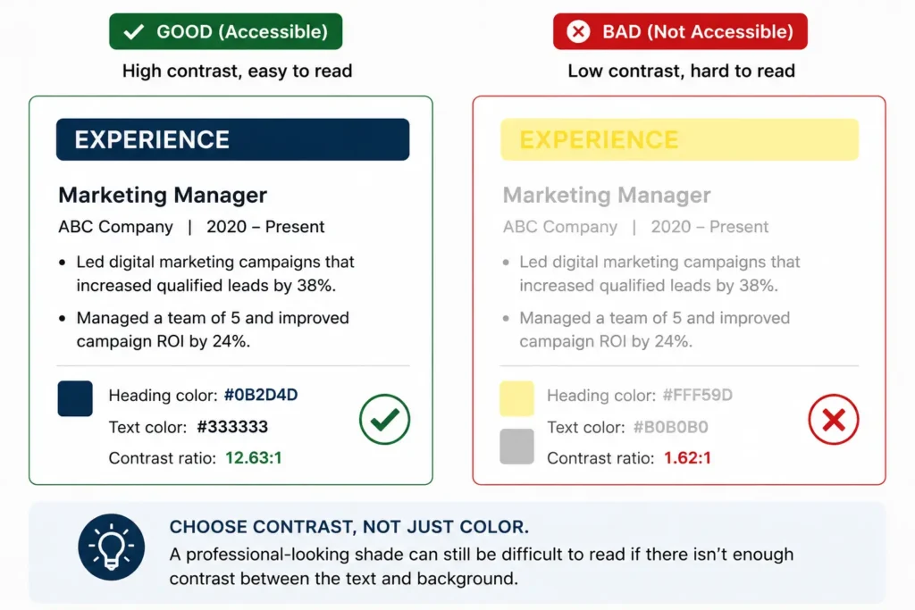
For readability, aim for a contrast ratio of at least 4.5:1 for normal-sized text against its background. This follows the WCAG accessibility benchmark for text contrast.
Our AI powered builder is here to help you to write a resume. Checkout here…

How to Use Color in a Resume?
When adding colors, always make sure that they don’t compromise the readability of your resume.
This is because hiring managers have to sift through hundreds of resumes, including resumes with color, and if they find yours difficult to read, they will just move on to the next.
When adding color, always think of contrast and hierarchy. Higher contrast between the color you use for your background and the color you use for your text will help make reading easier.
Similarly, choose a dominant color to use for the headings of your resume; this will draw the readers’ attention to them first. A secondary color can then be used to organize the content on your resume and highlight secretions of your resume.
Finally, you can use bright colors as accents to draw attention to the sections you want to highlight. For example, any achievement you made or a specific accomplishment you had at a company.
Choosing the right colors for your resume is vital, but at the same time, the way you design and format your resume is equally important. As a general rule of thumb:
- Be sure to use plenty of white space to ensure your resume content isn’t overcrowded.
- Use simple, clear fonts for the body of your resume and font size that is easily readable such as size 11-12.
- Make sure the colors, margins, style, and fonts are consistent throughout the resume.
- Avoid adding large paragraphs to your resume. Always use headings, bullet points, and concise sentences.

Best Resume Colors and Hex Codes
Here are some incredible color combinations you can use for your resume:
You don’t need a complicated color palette for a professional resume. Start with a white background and black or dark-gray body text, then choose one accent color for headings and other small design elements.
| Color | Hex Code | Best Use | Suitable For |
|---|---|---|---|
| Black | #000000 | Body text, headings | All industries |
| Charcoal | #333333 | Body text, headings | All industries |
| Navy | #1F3A5F | Headings, name, dividers | Business, finance, management, technology |
| Dark Blue | #1D4E89 | Headings, small accents | Technology, consulting, corporate roles |
| Dark Green | #285943 | Headings, dividers | Healthcare, education, sustainability, general professional roles |
| Burgundy | #7A263A | Headings, name, accents | Law, academia, management, creative-professional roles |
Safe Resume Color Combinations
1. Black + White
- Body text: #000000
- Background: #FFFFFF
The safest option for virtually every industry. It also reproduces reliably when printed or photocopied.
2. Charcoal + Navy + White
- Body text: #333333
- Headings: #1F3A5F
- Background: #FFFFFF
A restrained professional combination suitable for corporate, finance, consulting, operations, and management resumes.
3. Charcoal + Dark Blue + White
- Body text: #333333
- Headings: #1D4E89
- Background: #FFFFFF
A slightly more contemporary option that works particularly well for technology, marketing, business, and professional-service roles.
4. Black + Dark Green + White
- Body text: #000000
- Headings: #285943
- Background: #FFFFFF
A subtle alternative to blue that can work well for healthcare, education, environmental organizations, and other professional settings.
5. Charcoal + Burgundy + White
- Body text: #333333
- Headings: #7A263A
- Background: #FFFFFF
Burgundy adds personality without the intensity of bright red. Keep it limited to headings, your name, divider lines, or other small accents.
These combinations are starting points rather than industry rules. Employers do not require accountants to use navy or healthcare professionals to use green. Readability and consistency matter more than the particular accent color you choose.
How to Use Color on a Resume
Color should make your resume easier to scan—not harder to read. Use these guidelines when choosing your resume palette:
Keep Body Text Dark
Use black (#000000) or dark gray such as #333333 for descriptions, bullet points, dates, skills, and other important information. Light gray and pale colors may look elegant on a screen but can become difficult to read or print.
Use One Main Accent Color
Choose one restrained accent color and apply it consistently to your name, section headings, or divider lines. Using several competing colors can weaken the visual hierarchy of your resume.
Check Text Contrast
As a practical accessibility benchmark, normal-sized text should have a contrast ratio of at least 4.5:1 against its background. Large text has a lower WCAG benchmark of 3:1.
For example:
Accessible:
#333333 text on #FFFFFF background — strong contrast and easy readability.
Accessible:
#1F3A5F navy text on #FFFFFF — suitable for headings and other prominent text.
Avoid:
Pale yellow text on white — insufficient visual separation.
Avoid:
Light gray text on white — important resume information can become difficult to read.
Passing a numerical contrast test should be treated as a minimum, not a reason to make important resume text unnecessarily faint.
Don’t Use Color as the Only Signal
Don’t make employers depend on color to understand your resume. For example, section headings should still be identifiable through text, size, weight, and spacing—not simply because they are blue.
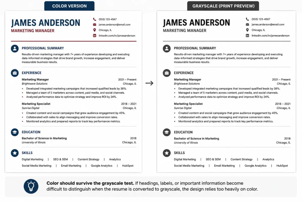
Check Your Resume in Grayscale
Before submitting your resume, preview or print it in grayscale. Your headings, dates, job titles, and body text should remain easy to distinguish when the color disappears.
This matters because a recruiter may print your resume using a monochrome printer or view it in circumstances where subtle color differences are lost.
Use a White Background
For most applications, use a white or near-white background. Avoid colored resume paper, large pastel backgrounds, gradients, and dark backgrounds unless you are creating a highly specialized design portfolio where visual presentation is itself part of the work.
For a standard job application, readability and reliable printing are more valuable than decorative background color.
Conclusion
Choosing the best color for your resume is about creating a professional, readable, and memorable first impression. Neutral colors like navy blue, dark gray, and black are suitable for almost every industry, while subtle accent colors can help your resume stand out without distracting from your qualifications. The key is to use color strategically to improve organization and readability—not to overwhelm the content.
As you design your resume, prioritize clear formatting, consistent typography, and an ATS-friendly layout alongside your color choices. By combining the right resume color with strong content tailored to the job description, you’ll create a polished resume that captures a recruiter’s attention and increases your chances of landing an interview.
FAQs
The best resume colors are navy blue, dark gray, black, and deep green. These colors look professional, are easy to read, and work well across most industries while remaining ATS-friendly.
Color itself does not determine whether an applicant tracking system can parse your resume. ATS problems are more commonly associated with how information is structured and encoded. Keep important information as selectable text, use clear section headings, and avoid relying on graphics, icons, text embedded in images, or color alone to communicate essential information.
Yes, using color sparingly can make your resume more visually appealing and help important sections stand out. Stick to one or two professional colors for headings or accents, and keep the main text dark for maximum readability.
Avoid bright or distracting colors such as neon green, hot pink, bright yellow, or multiple contrasting colors. These can make your resume look unprofessional and distract recruiters from your qualifications.
Yes. Conservative industries like finance, law, healthcare, and government typically prefer classic colors such as black, or dark gray. Creative fields like marketing, design, and media allow for more personality through tasteful use of colors like teal, burgundy, or dark green.
In other words:
Navy isn’t “ATS-friendly.”
A well-structured resume using navy can be ATS-friendly.
Absolutely. Using a professional accent color for section headings can improve readability and create a polished appearance. Keep the color consistent throughout the resume and ensure there is enough contrast against a white background.
A resume with subtle professional colors is generally preferred for digital applications because it helps organize information and improves visual appeal. However, if you’re unsure about the employer’s preferences or expect the resume to be printed, a black-and-white version is also an excellent choice.