
What is the best font for a resume? What size should the font be? What is Font styling – bold, italic? Which is best – Serif or sans serif?
Job hunting can be quite stressful, especially when you send out resumes left, right, and center, but you never hear back from any of the companies.
Does that make you wonder if maybe your resume was not up to the mark? 🤔
When it comes to developing your resume, even the tiniest details matter. Thus, we will tell you what mistakes you are making in your resume regarding fonts and font sizes so that nothing can keep you away from your dream job.
The first and foremost thing you need to do is figure out which font is best for your project.
Since there are hundreds of fonts to select from, finding the correct one that fits your resume might be tough.
However, by the end of this extensive guide, you will be able to form an informed decision that will help your CV stand out.
So, let’s start our resume fonts guide.
The Six Main Types of Fonts
In order to choose the best font, you must first educate yourself on the various forms of fonts available nowadays. They are categorized into six types:
Serif
The presence of serifs at the tops and bottoms of most letters distinguishes this font style from others with a more conservative design.
This timeless font can be utilized in a range of applications and is unlikely to go out of style. Many well-known companies, notably those in the fashion and financial areas, use serif fonts.
Slab Serif
Traditional serif typography first appeared in the 19th century, and slab serif is its spin-off, sporting a bolder and chunkier look.
The viewer’s attention is drawn to their block-like serifs, which are used in huge media areas like billboards.
Sans Serif
Sans serif fonts lack the frills of their predecessors and favor a cleaner, more modern look. This contrast makes them a good match for serif typefaces.
Since the lines are all the same width, this font is considered simpler compared to others. Consequently, many companies are beginning to use sans serif fonts to achieve a more professional appearance.
Script
Cursive handwriting is used in script fonts. They might be formal or casual, but they always leave an impression.
In casual designs based on script fonts, trends are frequently used. On the other hand, some firms have managed to build their own distinct style.
Decorative
As you can tell by the name, decorative fonts are made of a variety of styles and graphics.
They are often suited to certain firms as most ornamental types are effective for various industries and demands.
Handwritten
Handwritten fonts differ from script fonts since they use a more natural writing style. As there are so many different handwriting styles, this font may be incredibly versatile.
They are described as being artistic, lighthearted, and laid-back.
Independent labels and businesses such as coffee shops and bakeries love to sport them in their advertisements.
The Fonts For Your Resume
It is essential to invest time and thought into your font selection if you want to convey a feeling of style, professionalism, and individuality.
The following fonts have become standard for resumes because they are easy on the eyes and enhance the readability of your resume:
Arial
Many people believe that Arial is the safest bet. This sans-serif typeface is frequently used for branding, so it is a good choice if you are in the creative area or applying for a marketing or graphic designing position.

While Arial is still widely regarded as an excellent choice, it is worth mentioning that it has grown so prevalent that some hiring managers find it very boring.
Calibri
Calibri is a great option for a safe, widely legible sans-serif font, having replaced Times New Roman as the default Microsoft Word font.
It is a modern typeface that seeks to optimize readability by avoiding antiquated serifs while avoiding the dramatic flourishes of other modern fonts—ideal for today’s resumes.
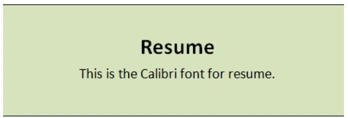
It is an easy to read and professional font. Not to forget, as Calibri is a default font, it will generally render correctly when the hiring manager opens your resume.
An essential drawback to keep in mind with Calibri is that some interviewers may deem it unattractive and low-effort because it is a default font in MS Word.
The recruiter may feel that the prospect doesn’t care about the finer points and just goes with what is easiest – not the best impression to make on an interviewer.
Cambria
Another Microsoft Word staple is this serif font. This typeface was designed in 2004 to be suitable for “on-screen reading” and look nice when printed at small sizes. It makes it incredibly easy for readers to quickly comprehend smaller text sizes.
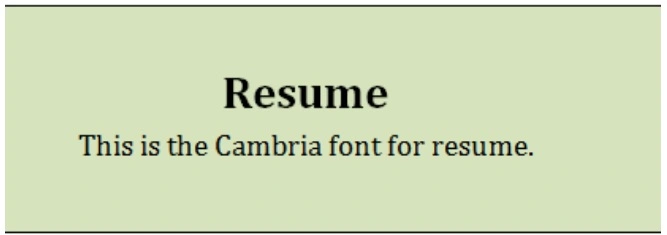
Even though it’s frequently considered one of the more “old school” selections, this font will remain a terrific choice for resumes and cover letters.
Garamond
Garamond is a font family with a long history, with designs dating back to approximately the 15th and 16th centuries.
It is commonly utilized for its aesthetics as well as readability. Garamond font is ideal for a resume in a non-corporate profession and can also be used sparingly in a corporate setting.
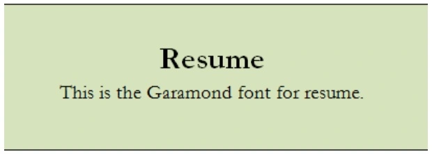
This Font is a favorite among ad managers and designers as it meets all the requirements of a worthy resume font: Garamond is attractive, easy to read, and classy.
Many people consider this font to be outdated as it has quite a long history; a progressive company may not appreciate its use.
Georgia
Georgia is one of the most widely used fonts for resumes and other documents. You will see many big names like Amazon, Twitter, and Yahoo using this. It is incredibly easy to read online, which makes it perfect if you wish to send a resume as a PDF.
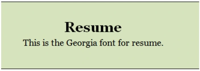
When compared to Garamond, it is viewed as a more modern Serif typeface. Georgia is similar to Times New Roman, but it has been updated to be more modern and is simpler to read.
Helvetica
Helvetica is a beautiful, easy-to-read sans-serif font that is still popular in the advertising profession.
No wonder, you see BMW using this neo-grotesque typeface for their signs. Professionals rank Helvetica as one of the best fonts to use on a CV.
So, this is the font to use if you want to add a little flair to your resume while also retaining the same level of professionalism as some of the classic fonts.
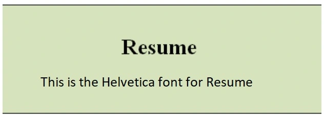
However, if you use MS Word, you won’t find it under fonts as it only comes preloaded on Macs. You will have to buy it, or you can also opt for Arial as it is much similar to Helvetica.
Times New Roman
This font has to be everyone’s favorite when it comes to resumes or anything in general. Times New Roman is a Serif Typeface.
It was commissioned by the British newspaper The Times in 1931 and conceived by Stanley Morison, the artistic adviser to the British branch of the printing equipment company Monotype in collaboration with Victor Lardent.
Times New Roman is a historic, classic, and immediately recognizable font that is still used to date.
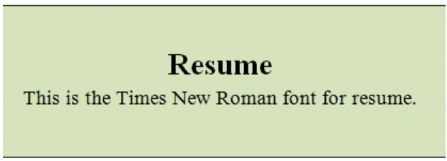
It has become one of the most popular typefaces of all time and is installed on most desktop computers.
This font may be a bit too “classic” when it comes to making your resume stand out.
It is mostly used in 12 poins font size.
Selecting A Font Size
Now that you have learned about the common types of fonts used in resumes, there is another feature that you must cover:
Resume font size because you have to use the best font for resume.
If you choose a size that is too large, your resume will most likely be more than one page long, even if you do not have the years of experience to support that length.
And no, this is not a good thing.
On the other hand, if you choose a font size that is too small, the recruiter will have to squint to read your resume. This is the last thing you want, and it will almost certainly result in you being rejected.
Here are the general recommendations regarding font sizes and layout to avoid making any mistakes:
- Name: 18 to 24 points
- Titles and Headers: 12 to 16 point headings
- Body text: 10 to 12 points
The size of your text will influence other aspects of your resume, such as the amount of white space, which should be maintained to a minimum.
While the body of your writing should be understandable and consistent throughout, the headlines on your resume should be large enough to capture the reader’s eye.
Font styling
- Bold the text that you want to emphasize on. It will attract special attention from hiring managers. You can use them to draw attention towards your special skills .
- In a similar way Italic style can be used to support the main text. Main difference between where you want ‘Bold’ styling and ‘Italic’ styling is that the former is done to highlight a specific word(can be your skill) Whereas later is done mainly to highlight the entire sentence .
- One must refrain from too much styling – For example underlining the text or changing color of a particular word or a sentence. It is unprofessional and has a negative impact on potential employers.
Sans Vs. San Serif
The design feature of a font merits its own section. The serif is an easily overlooked feature that distinguishes fonts and divides them into two groups.
The serif is the little tail or embellishment that appears at the end of most letters.
On the other hand, Arial is sans serif because it lacks serifs. The lines of Arial are smoother and straighter, with no tails. Both fonts have a professional feel to them.
Choosing a Serif or Sans-Serif font is more of an art than a science, but here are a few key takeaways that will make sure your resume stands out.
Key Takeaways
- You want people and automated scanners to be able to read your resume easily. So offer them something they can easily digest. The easier it is for a reader to read your resume, the more likely you are to get an interview. You may rely on your fonts to make your words look sharp.
- A very clear font will make it easier for the resume writer to check for typos and grammar errors.
- Prefer a professional and easy-to-read font and pick the right font resume size if you want your resume to be impressive.
- You must avoid thin or light fonts for your resume.
For example, if you’re using a resume format in Word, stick to standard fonts like Calibri or Arial to ensure a professional look.
Of course, companies will be most interested in your experience and skills, but font and font sizes are the little things that matter.
In short, adopting a legible font in a sensible size will increase your chances of receiving your CV the attention it deserves, so make sure that you choose wisely.
Now that you know all about the good resume fonts, you can make that decision easily and effectively.
Still have any doubts regarding ‘which fonts are best for your resume?’ or ‘ How to style your resume?’ . Feel free to contact us “customerservice@myresumestar.com” .
To know about ‘Resume Margins‘