
 Written By Editorial Team
Your resume is one of the most important tools for your job search. It shows a potential employer who you are, your skills and training, work experience, achievements, and education. For a very long time, it was believed that resumes should steer clear of creative design and colors and instead follow a simplistic black-and-white format.
This has changed with the digital age; black ink on white paper is old school and color on resume is the new trend.
Undoubtedly, the classics never go out of style, but today, resume experts believe you can add colors to your resume. A colored resume is especially great for positions like graphic designers, illustrators, interior designers, fashion designers, and visual artists. However, be careful while doing so.
Not all colors are suitable for your resumes, and the way you use colors is an important matter.
Read on to discover how you can use colors to make your resumes stand out and what colors are the best for your resumes.
Color Psychology: Can Colors Impact Your Employee’s Perception?
Adding color to your resume can help you stand out from the countless others applying for the same position. But that’s not all; research shows that colors can play an essential role in conveying information, creating certain moods, and even influencing the decisions people make. A study related to decision-making processes in individuals found that different color applications can influence users’ decision-making processes.
Adding color to your resume can help you stand out from the countless others applying for the same position. But that’s not all; research shows that colors can play an essential role in conveying information, creating certain moods, and even influencing the decisions people make. A study related to decision-making processes in individuals found that different color applications can influence users’ decision-making processes.
You shouldn’t use a color simply because you like it; each color has its own attribute and so should be used accordingly.
- Red, for instance, symbolizes power, action, strength, and passion. It is often linked to growth and a will to survive. Bright red can be hard on the eyes, so it is usually recommended that you use darker shades of red in your resumes, such as burgundy.
- Blue symbolizes trust, integrity, and reliability. You have probably noticed that financial institutions and social media sites use blue to convey these attributes. This makes blue an ideal color to apply for a position in financial institutions, IT firms, and non-profit organizations.
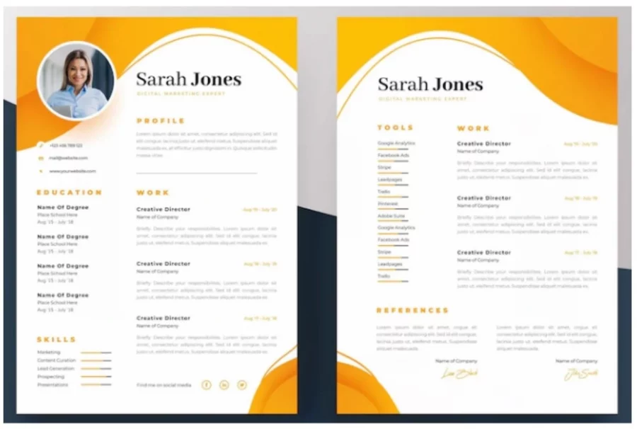
- Yellow symbolizes positivity, joy, and optimism. However, yellow can be a flashy color so use it wisely. For example, you can use it to highlight certain points of your resumes.
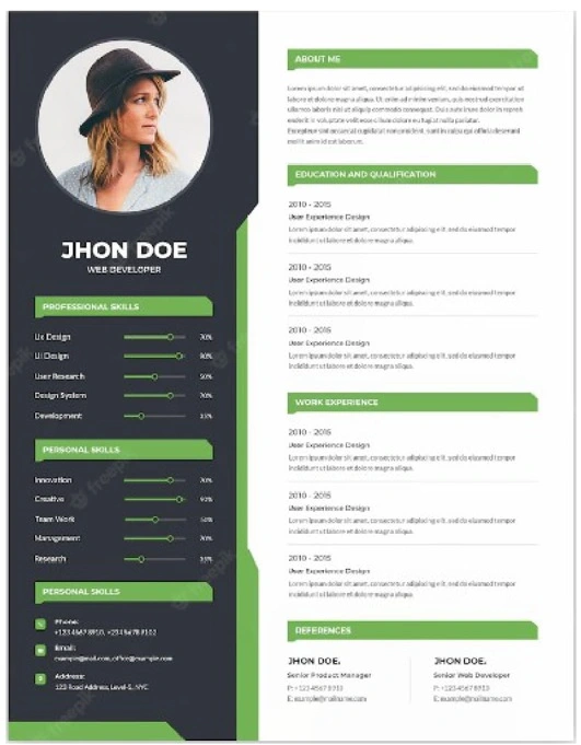
- Green symbolizes freshness, vitality, growth, and health. Using green in your resume is a good idea if you are applying for a position in an eco-friendly organization.
- Purple symbolizes wealth, luxury, and royalty. Many top managers tend to use purple in their resumes.
If you are applying for a job the first and foremost thing that you need is a resume.
Our AI powered builder is here to help you to write a resume. Checkout here…
What Are The Best Colors For Your Resume?
There is no one best color for resume. The color you choose depends on the position you are applying for. However, there are some basic guidelines you should follow when creating a resume with color.
- You should generally avoid adding overly bright and flashy colors to your resume. These can seem unprofessional and drive the attention away from the content of your resume, which can be viewed negatively by a hiring manager. Instead, you should use more subtle colors.
- If you want to know what is the best color for resume paper, you should choose pastels or muted tones. A light background should provide a nice contrast for the content on your resume without driving attention away.
- Similarly, dark colors can be used to create a nice contrast when you use them as your font. Using darker colors for the headings on sections such as your work experience and achievements can be pretty effective. On the other hand, avoid using bright colors against a white background as this can render your text unreadable.

How to Use Color in a Resume?
When adding colors, always make sure that they don’t compromise the readability of your resume.
This is because hiring managers have to sift through hundreds of resumes, including resumes with color, and if they find yours difficult to read, they will just move on to the next.
When adding color, always think of contrast and hierarchy. Higher contrast between the color you use for your background and the color you use for your text will help make reading easier.
Similarly, choose a dominant color to use for the headings of your resume; this will draw the readers’ attention to them first. A secondary color can then be used to organize the content on your resume and highlight secretions of your resume.
Finally, you can use bright colors as accents to draw attention to the sections you want to highlight. For example, any achievement you made or a specific accomplishment you had at a company.
Choosing the right colors for your resume is vital, but at the same time, the way you design and format your resume is equally important. As a general rule of thumb:
- Be sure to use plenty of white space to ensure your resume content isn’t overcrowded.
- Use simple, clear fonts for the body of your resume and font size that is easily readable such as size 11-12.
- Make sure the colors, margins, style, and fonts are consistent throughout the resume.
- Avoid adding large paragraphs to your resume. Always use headings, bullet points, and concise sentences.
MyResumeStar Offers Professional Resume and Cover letter builder. Click here to see our resume design and templates.
Best Color Combinations for Your Resume
Here are some incredible color combinations you can use for your resume:
Blue + Ivory
Blue is an excellent color for your resume. You can easily contrast it with ivory or a color close enough to white for a classic yet modern feel. Pair it with black text, and you will be good to go!
Burgundy + Maroon
Burgundy accents always give a professional feel: pair burgundy with a deep maroon for your subheadings on a white background. Finally, add black text for a clear, clean, and readable resume.
Blue + Yellow
Blue and yellow colors are excellent for contrast. They are better suited for more creative resumes; however, since they tend to be quite attractive, adding minimalist design elements to your resume will tie it all together.
Green + Grey
Dark green and grey colors give a rustic feel and are a great color scheme for your resume. Adding dark green accents of light grey and white sections gives a unique, elegant visual style to your resume.
All in all, it’s safe to say that you can add colors to your resume. But you should be careful when adding color in a resume. Choose the best resume colors according to the profession you are applying for and the impression you are looking to make.